BLOG ENTRY : I LOVE MEDIA QUERIES !!! (and you should too)
see all blog entriespublished : mar 25, 2026
One thing I’ve always tried my best to do is to make sure the site looks good and is functional on different-sized screens. When I first made the site along with the rest of my friends in 2023, one thing I was immediately worried about was : « oh my god it looks terrible on a phone ». This is a logical point of concern, I’d think. I figured out pretty quickly how media queries worked and tweaked the format of the old site to make it fit on mobile. Here’s a blast from the past : if you were around for the OG OG days of the site, you’ll recognize the old style from this screenshot taken immediately after I fixed the mobile layout for the first time.

(I was in elation specifically because of the acquisition of this new skill.)
My enthusiasm for media queries does not seem to be universal, however. Surfing the web for personal sites on your phone, you might see sites that are small and hard to read, requiring you to zoom in and scroll horizontally to navigate (which is almost always an unpleasant experience). Alternatively, depending on how it was built, the layout might be thoroughly fucked and partially, if not entirely, unusable. This can be frustrating ! Yeah okay I could put my phone down and open my laptop, but what if I’m out in the world with nary a wide monitor in sight, or better yet so cozy in my bed at midnight, getting out the Big Screen being an unwise idea ?
I don’t blame new coders for not knowing how to make responsive layouts. I was that guy once, and a lot of the indie web is people trying code for the first time. It’s a little stranger when it’s a beautifully crafted intricate site and then I resize my browser and oopsie doopsie it’s broken. I think if you’re skilled enough to put together a complex layout from scratch, you’re also skilled enough to tweak your components to fit on a smaller screen, but who knows, I’m not very good at code myself, I can’t speak on what experts know or don’t know.
Once, while checking out r/neocities, I saw a beginner coder asking for help on learning how to style a website. The odd thing ? They Specifically mentioned that they did not want to make their website responsive. Huh ???
The reason they gave was the limit on creative expression, and they called optimizing for mobile « corporate ». It’s been a few months and I’m still baffled at this take.
Given that the wide desktop screen, is, well, wide, and therefore a much larger and more effective canvas, I get the frustration at having your creative expression limited by formatting for mobile. However, it doesn’t mean that there is no merit to making it available anyways. On smaller screens it may be a lesser experience, but why limit the experience entirely ?
It’s such an arbitrary barrier to access one’s site. Sure, the old web wasn’t optimized for mobile because mobile did not exist. But web revival is not about going back, it’s about moving forward ! If we’re trying to build online web revival communities to be superior to mainstream corporate social media, it’s absolutely ludicrous to be opposed to accessibility, to limit usability more than necessary, to be fine with leaving people out. Thinking again about a hypothetical scenario where I’m out on the town but I want to check out websites on the bus or something, why does it need to be more difficult ?
This all drives me a little crazy, but complaining about random people’s opinions and practices won’t do much, so now, to say something beautiful and true, I’ll talk about how I use media queries !
The handy media query is a feature that can, among other things, check the resolution of the user’s screen, and if it is wider/thinner than the minimum/maximum width set, it adapts the style of an element accordingly.
For example, the below code sets the default width of the class mydiv as 700 pixels. However, if the screen is smaller than 700 pixels, it instead sets the width of the class to 100% ; it fits the whole screen, which is ideal for smaller resolutions.
(note : percentages for widths are your friend when thinking about responsiveness, but when building for desktop, don’t limit yourself to them ! A set static width is still very useful.)
Paired with using divs/sections to group elements together and an adjustment of margins and possibly font sizes, this method prioritizes legibility to the detriment of a creative layout, but the small screen already doesn’t do multi-column and other more complex layouts many favours, so you might as well at least make your content easy to read.
A really good example is my Chappell Roan shrine, which is still one of my favourite pages I’ve ever done. If you’re on desktop, resize your tab and see how the two columns stack on top of each other ! And if you’re on mobile, flip your phone to see the one column become two ! Fun fact, the layout for this page was inspired by another shrine I found once ; I saw it and immediately thought to myself that I wanted to make something like it. Then I was like, « Ooh, I wonder how this is optimized for mobile devices ! » Then I shrunk the browser and OOPS. It wasn’t mobile-friendly at all. I was then motivated by spite to create a similar layout but responsive.
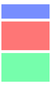
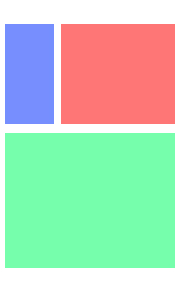
Though it is a primary aspect, responsiveness does not end at adjusting widths. There are other things to do to help you on your quest. CSS Flexbox is a layout model that is specifically built for responsiveness and it’s saved my ass so many times. Here’s a game to learn it ! It has frogs ! Armed with such tools, you can take a layout like this:

And turn it into something like these :
I don’t claim to be perfect in terms of accessibility. Admittedly, I’ve been slower than I’d prefer on picking up and implementing some accessible practices. Still, I want to try, and I want to advocate for trying as well. Responsive pages are a step I’ve for the most part overcome, a step I consider rather simple even, so that is what motivates me to yell out about it. I have no idea how coherent this is, but maybe this post could even teach someone something new. I would love to see more personal sites be responsive in the future.
check out : malloytonight and accessibility
see all blog entries